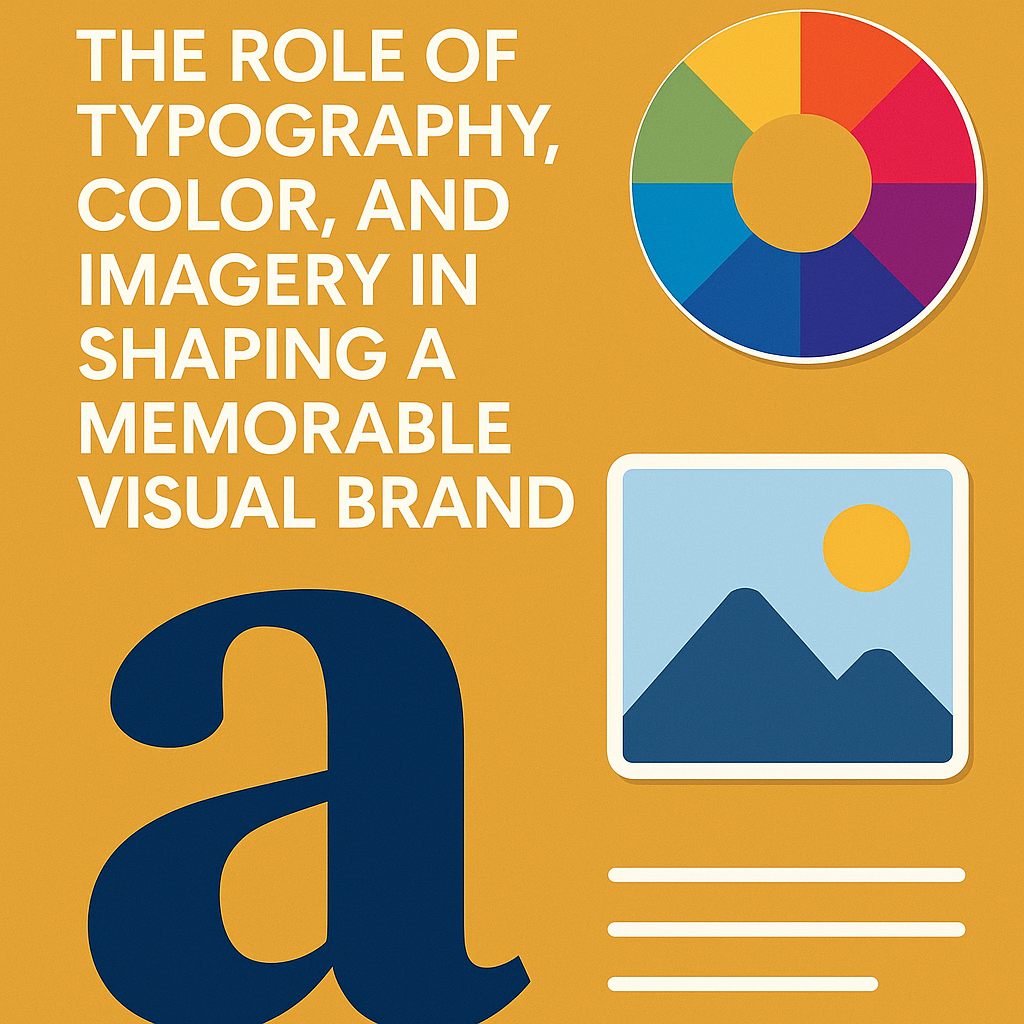
The Role of Typography, Color, and Imagery in Shaping a Memorable Visual Brand
You might have an excellent product, a clear message, and a functional website—but if your visual branding doesn’t resonate, people may scroll past and forget your business entirely.
Many brands struggle to keep their visuals consistent. They mix fonts, mismatch colors, or shift styles from one platform to another. The result? A brand that feels disjointed, confusing, and unprofessional.
The solution lies in mastering three essential components of your visual identity: typography, color, and imagery. When these elements are used with intention and consistency, they work together to create a strong, recognizable brand that builds trust and leaves a lasting impression.
What Is a Visual Brand—and Why Does It Matter?
Your visual brand is how your business presents itself visually. It includes your logo, font choices, color scheme, imagery, and overall design aesthetic. It’s what people see when they visit your website, view your Instagram post, or pick up your product.
Why is this important? Because people respond to visuals instantly. A 2022 study by Venngage revealed that businesses with consistent branding across all platforms can boost revenue by up to 23%. That’s how powerful visual identity can be.
Typography: More Than Just Picking Fonts
Typography isn’t just about choosing fonts—it’s about creating tone, hierarchy, and clarity in your brand’s voice.
Why Typography Matters
Fonts can influence how your brand is perceived. Serif fonts (with decorative strokes) tend to feel traditional or formal. Sans-serif fonts (clean and modern) suggest simplicity and innovation. More artistic fonts can express creativity—but they should be used with caution, especially for body text.
How to Use Fonts Effectively
- Stick to two font families—one for headings, one for body text
- Make headings bold and larger for quick scanning
- Avoid overly stylized fonts for long paragraphs—they’re harder to read
Consistent typography helps reinforce your brand’s personality and makes your content easier to digest.
Color: Creating Emotion and Instant Recognition
Color is one of the first things people notice about your brand. It can influence how they feel and even what they expect from your business.
Why Color Is Critical
Each color carries meaning. Blue can evoke calm and trust, green feels organic and fresh, while red communicates urgency or excitement. Choosing the right colors can make your brand emotionally resonant—often before a single word is read.
A study by the Institute for Color Research found that up to 90% of first impressions are driven by color alone.
How to Build a Strong Color Palette
- Choose 2–3 core brand colors that complement each other
- Apply them across all platforms—website, packaging, social posts, etc.
- Use contrast (e.g., bright buttons on a neutral background) to draw attention to key elements
Imagery: Communicating Without Words
Visuals tell your brand’s story faster than text. The photos, graphics, and illustrations you use set the tone and shape how people perceive you.
Why Imagery Shapes Perception
Every image reflects your brand values. A wellness brand might opt for soft, natural lighting. A tech brand may lean toward sleek, minimal, and high-contrast visuals. The key is choosing imagery that feels intentional and aligned with your message.
How to Maintain a Cohesive Visual Style
- Define your visual tone—light or dark, realistic or illustrated, soft or bold
- Edit images consistently (filters, brightness, color correction)
- Select visuals that reinforce your message, not distract from it
Your imagery should speak the same visual language everywhere your brand appears.
Tying It All Together: Building Consistency
Consistency is what makes your brand memorable. When your typography, colors, and imagery are aligned across your website, social platforms, product packaging, and ads, your brand becomes instantly recognizable.
How to Maintain Visual Consistency
- Create a brand style guide that outlines fonts, color codes, and image usage rules
- Use tools like Canva, Figma, or Adobe XD to manage and replicate designs across platforms
- Regularly audit your brand visuals to keep everything cohesive and up to date
How Visual Branding Strengthens Digital Presence
Your visual identity is the foundation of your digital brand experience. Whether someone lands on your homepage or scrolls past your ad, your visuals communicate who you are—before they read a word.
When your design elements align, your brand feels trustworthy, recognizable, and worth exploring. This is especially important if you offer creative services like logo design, packaging, or social media content. Every visual choice counts.
Final Thoughts
Typography, color, and imagery aren’t just design decisions—they’re strategic branding tools. When used consistently and thoughtfully, they shape how people feel about your business.
You don’t need flashy visuals or expensive design tools to build a strong brand. You just need to be clear, intentional, and consistent.
That’s how you create a visual brand that not only looks good—but one that people remember.