Top 7 Website Design Tips to Make Your Site Stand Out
Designing a website that grabs attention, keeps visitors engaged, and drives action involves more than just picking nice colors and layouts. It comes down to thoughtful, strategic design. And while website builders make the process seem easy, many businesses still struggle to create a site that both looks great and functions smoothly.
Why Visually Appealing Websites Still Fail
You’ve probably come across sites that look amazing—but are hard to use. Maybe they’re slow, confusing, or not mobile-friendly. The issue here isn’t a lack of creativity. It’s a lack of strategy and usability.
If your site frustrates visitors, they’ll leave. Fast. Research from the Nielsen Norman Group shows that people decide whether to stay or leave a webpage in just 10–20 seconds. That’s all the time you have to make an impact.
So, what’s the answer? Design that’s not only visually appealing but also functional and easy to use. Below are 7 proven tips that can help you build a website that truly stands out—for the right reasons.
Simple Yet Best Website Design Tips That Work
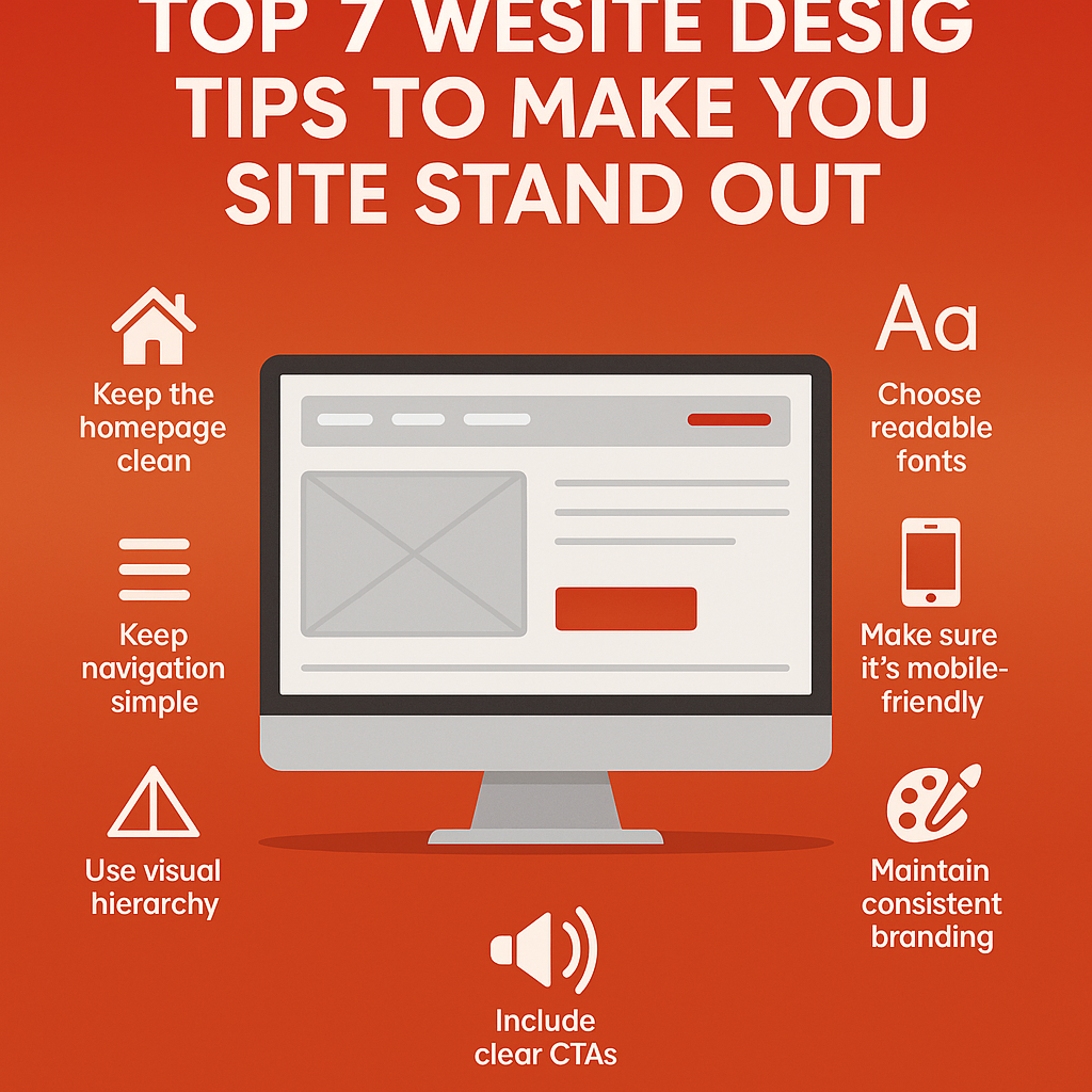
1. Keep The Homepage Clean and Focused
Your homepage is your digital first impression. A neat, well-organized layout makes it easy for visitors to understand who you are, what you offer, and where to go next. Clutter, on the other hand, creates confusion and drives users away.
Here’s how to keep it clean:
- Use a limited, brand-aligned color palette. Stick with two to three harmonious colors that reflect your identity. Too many colors can overwhelm visitors.
- Make space your friend. White space (or negative space) gives content room to breathe. It enhances clarity, improves reading flow, and draws focus to important elements.
- Choose readable, bold fonts. Simple, modern typefaces make your content easy to read. Avoid overly decorative fonts that reduce legibility or distract from your message.
2. Keep Navigation Straightforward
Your site’s navigation should feel effortless. Visitors should be able to find what they’re looking for in seconds—not get lost in a sea of links.
Keep menus simple and intuitive. Group similar pages, limit the number of top-level items, and make sure key actions (like “Contact” or “Get a Quote”) are clearly visible. When users don’t have to think about where to click next, they stay longer—and do more.
3. Use Visual Hierarchy to Guide the Eye
Visual hierarchy is the structure that tells users where to look first—and next. By playing with size, contrast, spacing, and position, you can guide visitors through your content.
Bigger headings, bold buttons, and well-placed sections draw attention naturally. Items higher on the page or centered on the screen typically get noticed first. Use tools like Figma, Canva, or Adobe XD to map out your layout and ensure the most important content pops.
4. Choose Fonts That Enhance Readability
Fonts have a huge impact on how your content is perceived and understood. If your site is hard to read, users won’t stick around.
Here’s how to keep things readable:
- Use digital-friendly fonts like Roboto, Open Sans, or Lato. These are designed to perform well across screens.
- Keep body text between 16px and 18px on desktop. Adjust slightly larger for mobile users.
- Be consistent. Set defined font sizes and weights for headings, subheadings, and paragraphs—and use them site-wide.
Readable typography supports accessibility and makes your content easier to explore.
5. Make Sure Your Site Is Mobile-Friendly
With more than 62% of global web traffic coming from mobile devices, responsive design isn’t optional—it’s essential.
A mobile-responsive website adjusts its layout, fonts, images, and buttons to fit smaller screens. This makes your site easier to navigate, read, and interact with—especially for users on the go.
When your mobile experience is smooth, users are more likely to stay longer, explore your offerings, and convert.
6. Maintain Consistent Branding Throughout
Every page of your website should look and feel like it belongs to the same brand. Inconsistent visuals—whether it’s colors, fonts, or logo placement—can confuse visitors and make your business seem unprofessional.
To avoid this:
- Stick to your brand color palette, typefaces, and tone of voice across all pages.
- Keep your logo in a consistent spot, usually top left.
- Use similar visual elements (icons, photos, buttons) site-wide.
Consistency builds familiarity and trust, both of which are key to keeping visitors engaged.
- Include Clear Calls to Action (CTAs)
A Call to Action (CTA) is a prompt that tells users what to do next—like “Buy Now,” “Request a Demo,” or “Get in Touch.” Without CTAs, even interested visitors may leave without taking the next step.
Make your CTAs clear, visible, and action-oriented. Add them where they naturally fit—at the end of product descriptions, in the site header, or near contact forms. Strong CTAs help guide user behavior and improve your site’s conversion rate.
Conclusion
Great website design is all about blending visual appeal with usability—helping visitors find what they need easily while keeping them engaged every step of the way. With these seven tips in place, your site can truly stand out and turn visits into action.
Looking for a team that can bring all these strategies together seamlessly? CreativeAlif builds websites that not only look impressive but are designed to perform from day one.