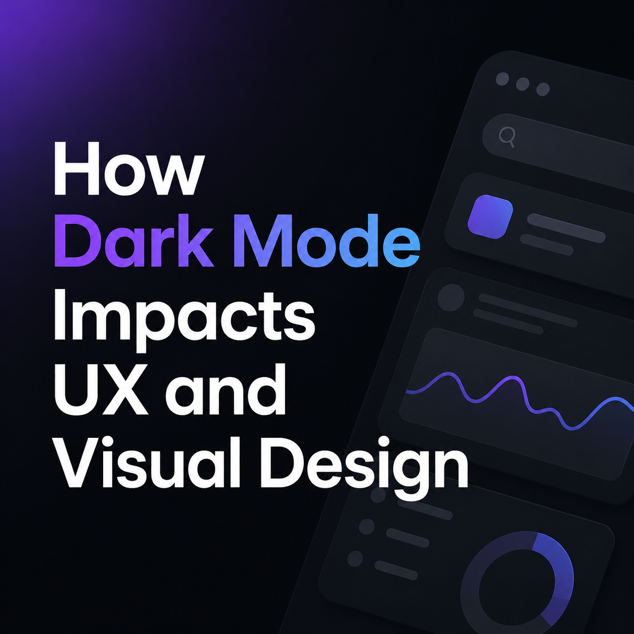
How Dark Mode Impacts UX and Visual Design
You have probably used a website at night that instantly felt smooth and comfortable to browse. Then there are websites that feel too bright, cluttered, or tiring after only a few minutes.
That difference often comes down to dark mode UX design.
Dark mode now plays a major role in website design, mobile app design, and user experience. A clean dark interface can improve readability, make navigation easier, and help users stay engaged longer. Poor dark mode design can make text harder to read and push users away quickly.
Why Has Dark Mode Become Popular in UX Design?
Dark mode became popular after phones, laptops, and apps introduced built-in dark themes. Once users got used to darker interfaces on their devices, they started expecting the same experience across websites and apps.
Screen time also plays a big role. People spend hours every day reading blogs, scrolling social media, replying to messages, watching videos, and working online. Bright white screens can feel harsh in darker rooms, especially during nighttime use.
Streaming platforms, gaming apps, and creative software pushed dark UI design even further. Videos, graphics, and animations usually stand out better on darker backgrounds. This helped dark mode become a major trend in modern UI design.
Many brands also prefer dark mode because darker interfaces feel clean, modern, and visually organized.
How Does Dark Mode Affect User Experience?
Dark mode changes the way users focus on content and interact with interface elements. Bright buttons, icons, and alerts attract more attention on dark backgrounds. This helps users notice actions quickly.
At the same time, too many bright elements can overwhelm the screen. Good dark mode UI design keeps a balance between contrast, spacing, typography, and color usage.
Reading behavior also changes in dark mode. Pure white text on a pure black background creates strong contrast, which can feel uncomfortable during long reading sessions. Professional web designers usually avoid full black backgrounds and use softer dark gray shades instead.
Text size and font weight matter more in dark mode too. Thin fonts can become difficult to read on smaller screens. Medium-weight fonts and proper line spacing improve readability and help users scan content more naturally.
Why Do Some Dark Mode Websites Feel Better Than Others?
The difference usually comes from spacing, contrast, and color balance.
Some websites use pure black backgrounds with bright glowing colors. This creates visual pressure after a while, especially during long scrolling sessions. Softer dark shades reduce that problem and create a smoother reading experience.
Spacing also affects dark mode usability. Crowded layouts feel heavier on darker backgrounds because shadows and borders become less visible. Clear spacing between sections, buttons, and text blocks makes the interface easier to scan.
Typography has a strong impact too. Large readable fonts perform better in dark mode because users can process text faster without straining their eyes.
Images and graphics often need adjustments as well. Photos designed for light backgrounds may look dull or overly bright in dark mode. Designers usually optimize contrast, shadows, and saturation separately for dark themes.
Does Dark Mode Reduce Eye Strain?
Dark mode can reduce screen glare in low-light environments, which helps many users feel more comfortable at night. The effect depends on screen brightness, lighting conditions, font design, and the user’s eyesight.
In bright outdoor environments, light mode often feels easier to read because sunlight reduces visibility on darker screens.
Users with astigmatism sometimes find white text on dark backgrounds harder to focus on. Letters may appear blurry or softer compared to dark text on white backgrounds.
This is why many websites and mobile apps allow users to switch between light mode and dark mode. Flexible theme settings improve user comfort because people use screens in different environments throughout the day.
How Does Dark Mode Affect Mobile App Design?
Dark mode has a major impact on mobile UX design because users spend long periods on phones every day. Small screens make readability and spacing even more important.
Many apps now follow the phone’s system settings automatically. If dark mode is enabled on the device, the app changes themes too. This creates a smoother mobile user experience.
Some OLED screens also use less battery power in dark mode because darker pixels consume less energy. This is one reason many smartphone users prefer dark themes.
Mobile dark mode design still requires careful testing. Weak contrast, small text, and poor spacing become easier to notice on mobile devices. Clear typography, medium contrast, comfortable spacing, and visible buttons improve mobile usability.
What Accessibility Problems Happen in Dark Mode?
Accessibility issues are common in poorly designed dark interfaces.
Low contrast text is one of the biggest problems. Gray text on dark gray backgrounds may look modern, but readability drops quickly for many users.
Buttons, forms, and navigation menus can also blend into the background if borders and spacing are weak. Hover states sometimes become difficult to notice too.
Good accessibility testing includes checking dark mode across different devices, brightness levels, and screen types. Designers also test readability for users with different vision conditions.
Accessible web design improves usability, user retention, and overall website engagement.
How Does Dark Mode Affect Branding and Visual Design?
Dark mode changes the overall feel of a website or app. Dark interfaces often appear modern, sleek, and premium. This is one reason many gaming brands, tech companies, streaming services, and creative platforms use darker themes.
Dark backgrounds also help colorful visuals stand out more clearly. Videos, animations, and product images usually attract more attention on darker layouts.
Still, dark mode does not work equally well for every industry. Educational blogs, long-form article websites, and news platforms often perform better with lighter reading layouts because users consume large amounts of text.
The best design choice depends on user behavior, content type, and audience preferences.
How Does Dark Mode Affect SEO and Website Engagement?
Dark mode is not a direct Google ranking factor, but it affects user experience metrics connected to SEO performance.
If users feel comfortable reading content, they usually stay longer on the website. Better engagement can improve bounce rates, session duration, and interaction signals over time.
A smooth dark mode website can also improve mobile usability for users browsing at night.
Still, readability should always come first. If text becomes difficult to read, users leave quickly. Poor user experience affects engagement and website performance.
SEO-friendly dark mode web design focuses on:
- Readable typography
- Mobile responsiveness
- Clear navigation
- Balanced contrast
- Fast loading speed
- Comfortable user experience
These elements improve both usability and long-term SEO performance.
What Does Good Dark Mode Design Look Like?
A strong dark mode interface feels balanced, readable, and easy to use. Text stays clear without looking too bright. Buttons stand out naturally without creating distractions.
Good dark mode websites usually avoid harsh neon colors, heavy glowing effects, and crowded layouts. Clean spacing and controlled contrast help users move through the page comfortably.
Professional designers also test dark mode on different screens because colors and brightness levels change between devices. Small adjustments in typography, spacing, shadows, and color tones often improve the experience significantly.
Conclusion
Dark mode has become a major part of modern UX design and visual design. It affects readability, accessibility, mobile experience, branding, user engagement, and website usability.
Well-designed dark mode interfaces create comfortable reading experiences and cleaner navigation. Poorly designed dark themes reduce readability and create visual fatigue.
Businesses should focus on user comfort, readability, accessibility, and balanced visual design when adding dark mode to websites or apps.
If you want a modern website with user-friendly UI design, smooth dark mode integration, mobile optimization, and strong visual experience, Creative Alif can help create a professional website that feels clean, readable, and easy to use across every device.
FAQs
Does dark mode improve website engagement?
Dark mode can improve website engagement when it is designed properly. Many users feel more comfortable browsing darker interfaces at night, which can increase reading time and interaction. Clean typography, balanced contrast, and smooth navigation help users stay longer on the website.
Why do some dark mode websites feel harder to read?
Some dark mode websites use pure black backgrounds and bright white text, which creates very strong contrast. This can make long reading sessions uncomfortable. Poor spacing, thin fonts, and weak color balance also reduce readability in dark mode UI design.
Is dark mode better for mobile apps?
Dark mode works well for many mobile apps because people spend long hours on phones, especially at night. It can create a softer viewing experience in low-light environments and may slightly improve battery life on OLED screens. Mobile apps still need proper spacing and readable typography for good usability.
Can dark mode affect SEO performance?
Dark mode is not a direct Google ranking factor, but user experience affects SEO performance. If visitors stay longer, interact more, and enjoy the reading experience, engagement signals improve over time. A user-friendly dark mode website can support better mobile usability and lower bounce rates.